Pages

Showing posts with label EDITING. Show all posts

Saturday, 5 December 2015

FINAL VIDEO - (Upload and Disclaimer)

CREATED, EDITED AND PRODUCED BY ELLA SANDERS, ANNA CURRAN AND ESTHER GRIMWOOD.
ANNA CURRAN - MIS EN SCENE/LIGHTING
ESTHER GRIMWOOD - CINEMATOGRAPHY
ELLA SANDERS - EDITING

'This is our final A2 Media Music video. Directed, produced and edited by Anna Curran, Esther Grimwood and Ella Sanders.
ALL MUSIC USED IN THIS CLIP IS NOT OURS. ALL RIGHTS GO TO VIRGIN RECORDING STUDIOS.'

This was the disclaimer we added onto the upload of our video. We wanted to make sure we weren't subject to any copyright infringements and also that we are respecting the artist and their music.


Friday, 4 December 2015

FINAL DIGIPAK

PHOTOGRAPHY BY ESTHER GRIMWOOD
LAYOUT & DESIGN BY ANNA CURRAN
ARTWORK (LIGHT PAINTING) BY ELLA SANDERS

This is the final digipak in its order and how it would be constructed within the CD case.
We thought that the colour scheme all matched well on the inside and the contrasted well with the outer colour scheme too.
It was simple enough to conform to the indie/pop genre and not be too much and overwhelming.

FINAL POSTER

CREATED BY ANNA CURRAN, ESTHER GRIMWOOD & ELLA SANDERS

I have started to edit the poster advert which was informed greatly by the work we did with the Digipak inside panels. We have included the tour dates and supporting acts but we feel that suppliers such as 'Ticketmaster' should be featured as well. Also, possibly introducing the 'sold out' stickers so to promote the star and make him seem more desirable. 

Thursday, 3 December 2015

Poster Editing Stages

The first stages of editing show how we adjusted the levels and contrast within our background image. We decided to desaturate the image as we thought it would let the text and different symbols stand out more so than it would on a colour image.
Also, as the indie genre is typically 'hipster' we thought this would replicate an old style, analogue picture which is used a lot in indie music.


The second stage shows how we added the main text and separate images to fill out the tour poster. The title is in white to contrast against the flat black background.
The supporting acts strip is made from the supporting artists' logos and then edited to create a white symbol so to let it also stand out against the poster.
The image in the bottom right hand corner was a promotion for our own album and features the front cover of the digipak we created.


The last stage shows how we added the tour dates and other information to the poster too. The extra information is all in white to again stand out from the background and to not divert attention from the star.
We then added 'sold out' stickers, which can be seen in the layers section of Photoshop, on certain dates to make the star seem desired by the public and so sell more tickets or CD's.

Digipak Editing Stages


This is the first proper editing stages of our Digipak after accumulating a lot of images whilst filming. We thought that light painting on the spines would be good because its quite simple and won't draw attention away from the star.
For the back cover, we used a photo which we took from when we were filming our performance scene in the  studio. Luckily, the song titles fit perfectly into the star's faces and so match well. It also means that all of the text can be done in white and it's not difficult to read.


The CD idea is one we got from the Bastille CD as it is very simple and, like the spines, doesn't take too much attention away from the photography used on the other panels.
This is the extra panel we had, so we decided to put the letter 'M' onto it much like how Bastille pastes the letter 'A' in their specialist font onto some of their posters. The light painting has been used again to keep up the theme.
The front cover is completely focused on the star which is conforming to conventions. We took the image in the studio and tried to light half of his face to create a strong profile portrait.
These are the panels that would feature behind the CDs so we decided that light painting would be simple enough but also bright enough to let the CDs stand out.

This was the left inside panel which we used to promote the tour dates for our star. This was useful because we can then take this idea and theme and put it straight into working with the poster advert.


The editing and typography were completed by myself once the images had been taken. The chosen images were taken on location by Anna and Esther, and then converted into Photoshop into the chosen layouts and styles that we had all decided as a group.


Wednesday, 2 December 2015

Final Video - Editing 10 (Titles)

To finish off the music video, we needed to add titles that stated what the song was and who directed, produced and edited it too.
So for the titles at the beginning, we orginally just had the one sentence which seemed quite boring but then Esther thought of the idea of staggering the sentence so that each word appears with the beat of the song. This works great with our music video as we have edited the majority of it to the beat.


Final Video - Editing 9 (Linking to Opening Sequence)

From our audience feedback, we now knew we needed to continue with the clips matching to the beat of the music as we had started to do so at the beginning and we would need to continue with it to make it even.
So, much like the opening sequence, we decided to time the clips to the strong beat that consists when leading up to the chorus again. This was very effective as it swelled with the music and meant that we weren't cutting straight from slow to fast.


Rough Cut - Audience Feedback

We showed our Media A2 class our rough cut of our music video in lesson time. The rough cut consisted of most of the clips bar the last part, as we hadn't had time to put in the bathroom clips just yet.
We then asked for feedback from the class, and one piece which we thought was very important was that the editing to the beat and then switching to the narrative was extremely effective. However, the class thought that we should cut back to editing to the beat and then back to narrative again, just so that there's continuity within our work. This will be our next, and hopefully final, step. 


Monday, 23 November 2015

Final Video - Editing 8 (Gap Filling, High Speed)

There is a part of the music which has swirling music in the background for about three seconds before it kicks into the chorus again. So we needed to either fill this part with a slow motion shot of Honor in the hotel room or short clips which replicated the beginning of the music video.
We decided, eventually, that due to the pace of the swirling music, fast paced shots would be more fitting for our theme and so we copied the beginning clips in and changed them to the same length. Then changed it to 800% faster than normal. We then finished it off with a slow motion shot as the swirling music died out which then matches up perfectly with the rest of the performance clips.

Friday, 20 November 2015

Final Video - Editing 7 (Slow Motion and Colour Correction)


At the moment, we are at the stages of filling in the smaller gaps which we left open for our bathroom and hotel room shots. Here, we were trying to match up the two clips which show the female character rolling onto her side so that it is smooth and continuous.
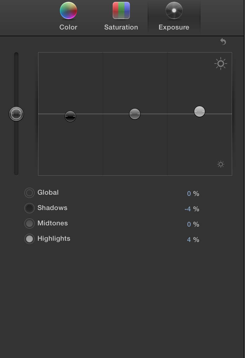
Unfortunately, we had to rely on daylight as our main source of light so colour correction was very important as it matched the clip with the rest of the film. We found out that you can 'match colour' when you go to the colour board so that all of these hotel room clips are now the same level of contrast and saturation.

Thursday, 19 November 2015

Final Video - Editing 6 (Opening Sequence)

This shows how we are now fitting in our new clips in with the beat of the music at the opening. The clips are cut three times and then disjointed so that they don't match but still show continuity. They cut to the three beats which are repeated in the opening sequence before the performance start. These clips then give a sort of back story to the whole music video as these clips are also used throughout.

Monday, 16 November 2015

Final Video - Editing 5 (Light Box Silhouette)

This is a technique that Esther thought would fit well into our music video. She set up the light-box to the right of Miles and then we filmed from the left which cast his face into a silhouette. We then colour corrected the photo so that the none of the features could be seen apart from the outline of the face. Unfortunately, the shape of the light-box meant that we couldn't fill the entire screen so we have to strategically try and crop and transform to fill the screen as much as possible.

Thursday, 12 November 2015

Final Video - Editing 4 (Studio Lip Sync)

Matching up the studio lip sync was very easy because by this time we had easily got the hang of final cut pro and also watching his singing. We also remembered this time to turn the sound on when recording which made the whole process a lot easier.
We then colour corrected the clips so they seem more desaturated and so they match the colour scheme of the rest of the video. We then took a number of screen shots and pictures of the colour board so that we could make sure all of the performance clips match.


Wednesday, 4 November 2015

Final Video - Editing 3 (Continuity)

These screenshots show how our continuity has been very important when we were piecing together our clips.
We have filmed the female character, Honor, smoking and we filmed her from the front and then side on. We then pieced these two clips together to show the different angles but we had to make sure that her lips were closed at the same time and that her blowing the smoke was all in order.
Also, at the line 'I took this girl outside with me, her name was Londie...' we pieced together three different clips to show the male and female character, Honor and Miles, walking and getting to the area where they performed.
Lastly, the bottom screenshot shows how we cut the clip of a club scene into very small sections and then deleted every other clip. This was to create a post production strobe light effect which paired well with the strobe we used in the pit with lighting.


Tuesday, 3 November 2015

Final Video - Editing 2 (Club Scenes)


We have started to piece together the club scenes to match with the scenes we took in Cambridge. We specifically took clips from outside the Junction in Cambridge to match the club theme which worked well when we matched it together with the clips from our make shift club in the pit.

Monday, 2 November 2015

Final Video - Editing 1 (Opening Sequence)

These are the first steps in making our final video. We imported our chosen track (What Would You Do) and then started to add in the clips of the club scene which had been slowed down and then colour corrected to fit our colour scheme. This was then placed in the parts of the opening which don't have the strong underlying beat which works well because the slow motion matches the slow, deep music.Once we have filmed our scenes from the hotel room, we will put those clips in where the gaps are in the opening.
We then decided to match up the lip syncing when using our actor instead of just ourselves and it went very well. Luckily, he had learnt the lyrics beforehand which meant the whole process was quite calm and collected.
We then also colour corrected this clip to fit in with the rest of the current opening sequence.

Cambridge Editing - Time-lapse

We decided to do a practice clip from our filming that we did in Cambridge.
We changed the saturation levels to adjust the colours of the scene. We wanted it to be darker and more dimly let which would reflect the mood of the actress. We also adjusted the shadows and highlights to dim the lighting and up the contrast to make the scene seem more intense.
We then adjusted the speed to 1000% to make the rest of world seem like it is running around her and making her seem extremely isolated.


Friday, 23 October 2015

Editing Opening (Using Old Jump Cuts)


Now we have filmed our club scene, we decided to fit our shots in with the practice shots we did during planning time. This shows the slow build up of our project and how the parts are slowly adding together to create our opening sequence.
We changed the colours and levels/contrast of the clip so to match our theme as the lighting was very bright and looked more like a bright summery club than the dark one we were aiming for.


Thursday, 22 October 2015

Editing Club Scenes - Timelapse


This is for part of video where we want the focus to be on the main actress, Honor. So we made all of the dancers dance in the background and made Honor stand still. This was important because then during time-lapse she would stay still and everyone would be bustling around her.
We put it in black and white as the strobes looked best desaturated and it also looked more like a club scene.


Editing Club Scenes - Slow Motion


For this club scene edit we experimented with the colour board to see what would look best for our music video style. We decided that a low saturation level and a slight dimming of the exposure was best for our music video.

We have also been playing with the speed of the video because we want it be slow motion and to fit in between shots of the Hotel Room. This will create a contrast between the fast and slow shots.

These clips will be used in our final video. But we will have to adjust the colour levels to match the rest of the video.

We have done a few slow motion clips in this style as we thought having more of a variety would help.