Pages

Showing posts with label DIGIPAK. Show all posts

Friday, 4 December 2015

FINAL DIGIPAK

PHOTOGRAPHY BY ESTHER GRIMWOOD
LAYOUT & DESIGN BY ANNA CURRAN
ARTWORK (LIGHT PAINTING) BY ELLA SANDERS

This is the final digipak in its order and how it would be constructed within the CD case.
We thought that the colour scheme all matched well on the inside and the contrasted well with the outer colour scheme too.
It was simple enough to conform to the indie/pop genre and not be too much and overwhelming.

Thursday, 3 December 2015

Poster Editing Stages

The first stages of editing show how we adjusted the levels and contrast within our background image. We decided to desaturate the image as we thought it would let the text and different symbols stand out more so than it would on a colour image.
Also, as the indie genre is typically 'hipster' we thought this would replicate an old style, analogue picture which is used a lot in indie music.


The second stage shows how we added the main text and separate images to fill out the tour poster. The title is in white to contrast against the flat black background.
The supporting acts strip is made from the supporting artists' logos and then edited to create a white symbol so to let it also stand out against the poster.
The image in the bottom right hand corner was a promotion for our own album and features the front cover of the digipak we created.


The last stage shows how we added the tour dates and other information to the poster too. The extra information is all in white to again stand out from the background and to not divert attention from the star.
We then added 'sold out' stickers, which can be seen in the layers section of Photoshop, on certain dates to make the star seem desired by the public and so sell more tickets or CD's.

Digipak Editing Stages


This is the first proper editing stages of our Digipak after accumulating a lot of images whilst filming. We thought that light painting on the spines would be good because its quite simple and won't draw attention away from the star.
For the back cover, we used a photo which we took from when we were filming our performance scene in the  studio. Luckily, the song titles fit perfectly into the star's faces and so match well. It also means that all of the text can be done in white and it's not difficult to read.


The CD idea is one we got from the Bastille CD as it is very simple and, like the spines, doesn't take too much attention away from the photography used on the other panels.
This is the extra panel we had, so we decided to put the letter 'M' onto it much like how Bastille pastes the letter 'A' in their specialist font onto some of their posters. The light painting has been used again to keep up the theme.
The front cover is completely focused on the star which is conforming to conventions. We took the image in the studio and tried to light half of his face to create a strong profile portrait.
These are the panels that would feature behind the CDs so we decided that light painting would be simple enough but also bright enough to let the CDs stand out.

This was the left inside panel which we used to promote the tour dates for our star. This was useful because we can then take this idea and theme and put it straight into working with the poster advert.


The editing and typography were completed by myself once the images had been taken. The chosen images were taken on location by Anna and Esther, and then converted into Photoshop into the chosen layouts and styles that we had all decided as a group.


Monday, 19 October 2015

Digipak Information

BAND NAME
- Miles

ALBUM TITLE
- Fugitive

SONG NAMES
CD1
- Random Look
- Trouble In The City
- What Would You Do
- Giant Soul
- Dangerous Promise
- Attack Of The Shadow
- Destruction
- Cold Thunder
- Mischief
- Hand Grenade
- Missing Battle
- Rocket

CD2
- Foreign Story
- Heartache
- Vesuvius
- Bones
- Step Away From Reality
- Fate
- Uncontrollable
- Ultimate Woman
- Bet On Your Dream
- Monster

Friday, 16 October 2015

Mock Digipak

We spent a lot of time in our lessons researching different products that inspired this mock up of our Digipak. After the research we completed, I went created this mock up of our what we wish our final project to look like. In this post, I will show the comparisons between ours and our inspirations.


FRONT COVER
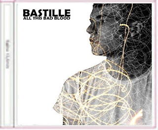
For our front cover, Anna had been researching different Photoshop techniques that we could use to make our cover more appealing to the audience. She found the 'Glitterbug' cover by The Wombats which would be perfect for our music video. We will overlay the lights of Cambridge onto the outline of our actor and actress. The version on the right is our own. It is a album cover I did for a photography project and so I know how to complete the techniques for this effect. However we will use a silhouette and have all of the features completely obscured.


BACK COVER

This wasn't really inspired by a different product, we just used shots of Cambridge in the back ground and then layered the images with some bokeh effect light painting to create the illusion of different coloured bright lights.
The text is similar to that of the Bastille CD back cover and we have tried to lay it out in a modern and simplistic way so that it doesn't bring too much attention away from the background.
For our final piece, I think we will experiment with different coloured texts so to match the colour scheme.


INSIDE LEFT PAGE


We thought it would be very important to include the signature symbol of Bastille. So I layered the 'A' over the top of the light painting and images of Cambridge at night.
Unforunately, our main star does not have the letter 'A' in his name. His name is Miles so we will possibly have to create our own symbol using one of the letters from his name.


INSIDE RIGHT PAGE

This, like the back cover, was done just using our own ideas. We thought that the layering of lyrics all over the page showing key parts of our song would be very important.
For the final piece, we would obviously include more lyrics but would also experiment with different font types, sizes and serifs.


CD STICKERS & BACKGROUNDS
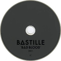

We decided that it was best to keep the CD sticker classic and plain, much like Bastille's own. This is so that attention isn't drawn from the main designs. We will have two CDs as there is a part 1 and 2 of the 'All This Bad Blood' deluxe album. We will put our own music video onto one of the CDs to complete the whole design and possibly the pitch or a voice over of our video onto the other. 

Thursday, 15 October 2015

Digipak Template

This is our Digipak layout that we will be importing our own images into. 
It has also been helpful because when printed, we can fold together to show a miniature version of the 3D digipak.
We will need to create six different panels as well as two CD covers.
In a follow up post, I will show the research we have done and our inspirations.


Wednesday, 14 October 2015

Digipak Task

BATILLE - Bad Blood

 The digipak for Bastille - Bad Blood is very simplistic but very good a representing the style of the band. The indie cover which was talked about in the Advert Task, shows that Dan, the main singer, is running away from the camera and this shows a lack of love for the fame and the money of it all but just the music.


The CD is once again very simplistic. I think that they were trying to recreate the look and style of vinyl which has now become very popular again. This would then appeal to the pop target audience.
The back cover of the CD case shows the car that is shining its headlights onto Dan. This shows that he is being chased or hunted down which links to the album title 'Bad Blood'.
The song list is very simple. However, the letter A has been replaced by Bastille's signature 'A' which is seen in the band's title and all over their tour posters or CD cases.


THE KOOKS - Inside In, Inside Out

This digipak conforms more to a pop music CD case as it includes a page which is dedicated to some of the bands photos. However, they have completed in an individual way. They have used film strips that are used in analogue cameras and they have been layed out like a contact sheet to see all of the photos from backstage or on tour.

They have also included a page which has credits on which is very common in all types of popular CDs. However the band's picture has been overlayed with another image which partially blurs out their features.

The CD case is quite bold compared to the rest of the CD digipak. I think this may be a way of saying that the music is extremely good compared to the quite low key case.