We spent a lot of time in our lessons researching different products that inspired this mock up of our Digipak. After the research we completed, I went created this mock up of our what we wish our final project to look like. In this post, I will show the comparisons between ours and our inspirations.
FRONT COVER
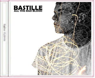
 For our front cover, Anna had been researching different Photoshop techniques that we could use to make our cover more appealing to the audience. She found the 'Glitterbug' cover by The Wombats which would be perfect for our music video. We will overlay the lights of Cambridge onto the outline of our actor and actress. The version on the right is our own. It is a album cover I did for a photography project and so I know how to complete the techniques for this effect. However we will use a silhouette and have all of the features completely obscured.
BACK COVER
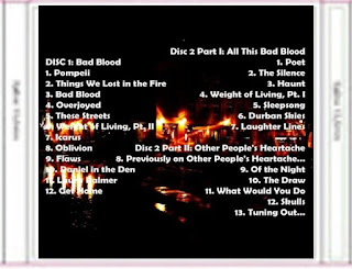
This wasn't really inspired by a different product, we just used shots of Cambridge in the back ground and then layered the images with some bokeh effect light painting to create the illusion of different coloured bright lights.
The text is similar to that of the Bastille CD back cover and we have tried to lay it out in a modern and simplistic way so that it doesn't bring too much attention away from the background.
For our final piece, I think we will experiment with different coloured texts so to match the colour scheme.
INSIDE LEFT PAGE


We thought it would be very important to include the signature symbol of Bastille. So I layered the 'A' over the top of the light painting and images of Cambridge at night.
Unforunately, our main star does not have the letter 'A' in his name. His name is Miles so we will possibly have to create our own symbol using one of the letters from his name.
INSIDE RIGHT PAGE
This, like the back cover, was done just using our own ideas. We thought that the layering of lyrics all over the page showing key parts of our song would be very important.
For the final piece, we would obviously include more lyrics but would also experiment with different font types, sizes and serifs.
CD STICKERS & BACKGROUNDS

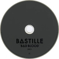
We decided that it was best to keep the CD sticker classic and plain, much like Bastille's own. This is so that attention isn't drawn from the main designs. We will have two CDs as there is a part 1 and 2 of the 'All This Bad Blood' deluxe album. We will put our own music video onto one of the CDs to complete the whole design and possibly the pitch or a voice over of our video onto the other.


No comments:
Post a Comment