Pages

Wednesday 9 December 2015

Evaluation - Question 4

THIS QUESTION WAS COMPLETED BY ALL OF OUR GROUP

4.How did you use media technologies in the construction and research, planning and evaluation stages?

Ella-Survey Monkey
Est-Final Cut 10
Anna-Photoshop
Ella-Equipment
Est-Blogger
Anna-YouTube

Me: 

To edit our Digipak and Advert we used Adobe Photoshop. This allowed us to use a wide range of effects and techniques to make our Advert and Digipak seem very professional. We mainly used Photoshop one we had planned and researched both of the products, so we mainly used it in the production stage of our video. If we didn't use photoshop to create the Digipak and Advert we think that the outcomes would not of been as strong and may have lacked a professional, finished look. 

We used YouTube to research music videos to influence our ideas. So it was an essential technology to use in the initial research and planning stage. Then after we had created our first rough cut, we then uploaded it to YouTube. This therefore allowed us to show our class easily and then get feedback from them.

Ella:

Survey Monkey allowed us to gather information on what our video should include, for example how much narrative there should be in comparison to performance. We were able to share the survey to a wide target audience from being able to share the link on a social media website which was Facebook. 

We used a range of equipment to achieve the highest quality music video and product. We used a DSLR which enabled us to create high quality shots with strong depths of field. This also allowed us to have high quality images for our digipak. The tripod was used in the performance shots to create shots that conformed to pop music video conventions. At other times we didn't use a tripod to create a non static image that fitted with the flow of the music. 

Esther:

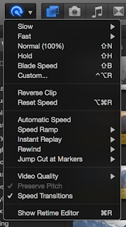
Final Cut 10 was the software that we used to edit and produce our final music video including the rough cut. It allowed us to explore various features such as slo motion which we used throughout the music video. It also allowed us to colour correct any shots which matched the indie/pop convention, it helped us also continue the effective continuity. As apposed to when we edited last year, editing was a lot easier with using the updated software. 

Blogger has allowed us to document our progress and development of our music video and digipak. We have been able to show the progression of our work through posts about editing  research and planning. It has also allowed us to incorporate YouTube videos, powerpoint presentations and surveys which enabled us to have all of the technologies in one place. 


(This script will be a voiceover on our video)


Evaluation - Question 3

THIS QUESTION WAS COMPLETED BY ALL OF OUR GROUP, BUT MAINLY CONTRIBUTED TO BY ANNA CURRAN

3. How effective is the combination of your main product and ancillary texts?


(Transcript from presentation)


Our video and the genre:
Overall:
Overall we felt that we comined all of our skills and resources together to create a strong video and ancillary pieces. We used the genre as our main reference point when making decisions on whether it will 
'What Would You Do'-By Bastille (Final video)
Genre-Indie/Pop
After researching what genre Bastille class themselves as, we gather that they fall under the Indie/Pop genre. We decided to follow a lot of the conventions associated with this genre. After looking at some of their videos and knowledge of the genre, we gathered some conventions that are in the Indie/Pop genre. For example the videos are lit a lot darker in comparison to a Pop music video and we wanted to continue this through both our Video and Ancillary texts. A few of their videos have a narrative theme instead of performance, but there is a quirky theme that runs throughout most of their videos. For example, the video for 'Oblivion' is mainly performance, but instead of the main singer lip syncing, they have a actress singing. This continues the convention that artists in the Indie/Pop genre will have quirky music videos.
Relations between the video and poster:
We decided that Miles would be the main focus on the poster, even though he is part of the band we felt that the main singer should be the only person on the cover. He is also the star image in the video, so we felt that we could create that link between them. We took the photo that is on the poster when we were filming on location, so this links to the 'What Would You Do' video. As we did in the video, we continued the theme to de-saturate the image to give it a raw effect. I think this is really effective and makes the male actor have the star image. We didn't want the girl to feature on the poster because she isn't the main focus of the album, only the song 'What Would You Do'. 
Relations between the video and digipak:
Similarly to the relationship between the video and the poster, we wanted the main singer to be the focus of the digipak. We looked at Bastilles album 'Bad Blood' and this album cover only had the main singer on it, so we felt that it was acceptable to only have the main singer on our digipak. We also wanted there to be some light painting in the digipak to differ from the shots of the actor/actress. Even though there isn't anything like this in the video, we felt as a group that it still worked in the Indie/Pop genre. We also took photos for the digipak when we filmed the performance section to the video, so there is a link between those two shots. 
'Miles' (Final Digipak)
'Miles' Tour poster
Final product and Ancillary Texts:
'Pompeii'-Bastille
'Things we lost in the fire'-Bastille
'Oblivion'-Bastille
We continued the typical characteristics of a Indie/Pop genre video. Keeping the theme running throughout it quite different and serious. We really wanted to have both performance and narrative shots to tell the story but then also link the two together so it didn't seem too divided. The girl in the video represents the sad part to the story and I think it works really well with the main singer acting as her support. I think that this would be something that Bastille would do. We also de-saturated the colour of a lot of the shots as we felt that this followed conventions of the Indie/Pop genre. As well as following this convention I think it has given a rawness to the video, making the girl seem even more vulnerable.

Evaluation - Question 2

THIS QUESTION WAS COMPLETED BY ALL OF OUR GROUP, BUT CONTRIBUTED TO MOST BY ESTHER GRIMWOOD

What have you learned from your audience feedback?


Survey monkey provides us with emails saying when we have new audience feedback meaning we were able to constantly improve our audience feedback constantly.
We really liked this approach and I feel like this is an application we will use in the future.
During the developmental process of producing our music video, we decided to produce a survey monkey to gather various information to develop our knowledge of the type of audience we were presenting it too. Questions asked were some such as "Whats your favourite band?" "what age are you?" What genre of music do enjoy?" and these questions really helped us find us the best way to get to our target audience. In terms of the type of people that would watch our music video, we found that they were of an age range between 18-30, meaning that we were able to make it more mature for that audience. We also found that the people watching were pretty 50/50 male an female meaning that we had too consider both a song male and female star image. Survey Monkey itself is a free website in which you can produce multiple questions to a survey with personalised answers. We were then able to post it on social media so we were able to reach a large platform of people and get a multitude of answers.
This would be a development from our previous market research but we would still use SurveyMonkey to collect responses from our audience.
Once we had completed our rough cut we presented to it to the class to get feed back from other media students. Our feedback included comments such as a few timing issues when we didn't cut exactly to the beat and a few colour corrections but other than that everyone seemed impressed with the brief outcome. Survey monkey was also the website of choice because they were able to provide us with graphs and pre formatted meaning we were able to get a clear indication of our target audience.


Evaluation - Question 1

THIS QUESTION WAS COMPLETED BY ALL OF OUR GROUP, BUT MAINLY CONTRIBUTED TO BY MYSELF

1) In what ways does your media product use, develop or challenge conventions of real media products?


Here we can see how our music video uses, develops or challenges the conventions of real media products.

- PERFORMANCE SHOTS
In your typical music video you would see performance shots which would have sole focus on the star. The lighting and backdrop should all be there to emphasise the star in the performance. For example in ours, we used a simple white back drop which let the artist stand out clearly. It also has a good contrast compared to the rest of the music video which is seen to be quite dark. One of the lights were shining on the backdrop which meant that the star stood out and didn't blend in, whilst the other light was shining to the side of the star to create a silhouette on one half of his face. We also created a shot which meant that the light box was behind the star which showed his features and created a desirable image.

- RHYTHMIC CUTTING
The rhythmic cutting is used in all music videos to fit with the emotion and theme. In ours we used rhythmic cutting to build up suspense before the chorus and then to slow it back down before it hit the bridge part of the song. We switched from this idea throughout the video so that we could show more shots that fit to the narrative. The narrative shots were a lot longer and showed more emotion on the character's faces and their actions.

- RED CUP PARTY
A 'red cup party' is typically an American party which features the classic red cup. This can be seen in the Afrojack music video, Summer, where the actors are seen dancing with red cups and with each other. This is why we decided to link the club scene with red cups as we thought it would show how realistic the club was. We have been told many times that the red cups actually made the clip work, that it completed the idea.

- REBELLION
The scenes of smoking and the bedroom a scenes are not typical of your pop music video as it would have to reach out to a wide age bracket. This meant that we were challenging conventions when we decided to link in clips from Cambridge and the Hotel Room which were particularly rebellious. We thought the rebellion was important in this video as the lyrics write a lot about rebellious activities and we wanted to have a strong lyric to video cohesion.

- NOT TYPICAL LOVE STORY
In a pop music video, you almost always have a love story that features throughout. This was an important aspect of our own music video, however our love story wasn't particularly conventional. In a pop music video you will see a love story that shows the beginnings of a relationship or the endings. In ours you see a relationship that isn't normally excepted by wider society but because of the nature of the song, it fit perfectly with our narrative.

- SOLD OUT STICKERS
Moving onto the digipak, we used images that we took when filming at our different locations to create a cohesion between our media products. We created a tour poster and a CD case which meant that we were able to use many different images and ideas to see what fit with our theme best. The tour poster had a number of locations and dates on which we then covered with 'sold out' stickers. This is used on many different tour poster to not only offer information, but to ensure the audience know that the audience is desirable.

- PROMOTION OF OWN ALBUM
We also made sure that our album and poster were cohesive, alongside the video. We made sure that when we created the poster, that we included the image of our own CD cover so to promote the CD. This combo is seen a lot on other tour posters as it is a simple and cheap way of selling two products at once.


(This will be a split screen video with myself and other clips.)

Saturday 5 December 2015

FINAL VIDEO - (Upload and Disclaimer)

CREATED, EDITED AND PRODUCED BY ELLA SANDERS, ANNA CURRAN AND ESTHER GRIMWOOD.
ANNA CURRAN - MIS EN SCENE/LIGHTING
ESTHER GRIMWOOD - CINEMATOGRAPHY
ELLA SANDERS - EDITING

'This is our final A2 Media Music video. Directed, produced and edited by Anna Curran, Esther Grimwood and Ella Sanders.
ALL MUSIC USED IN THIS CLIP IS NOT OURS. ALL RIGHTS GO TO VIRGIN RECORDING STUDIOS.'

This was the disclaimer we added onto the upload of our video. We wanted to make sure we weren't subject to any copyright infringements and also that we are respecting the artist and their music.


Friday 4 December 2015

FINAL DIGIPAK

PHOTOGRAPHY BY ESTHER GRIMWOOD
LAYOUT & DESIGN BY ANNA CURRAN
ARTWORK (LIGHT PAINTING) BY ELLA SANDERS

This is the final digipak in its order and how it would be constructed within the CD case.
We thought that the colour scheme all matched well on the inside and the contrasted well with the outer colour scheme too.
It was simple enough to conform to the indie/pop genre and not be too much and overwhelming.

FINAL POSTER

CREATED BY ANNA CURRAN, ESTHER GRIMWOOD & ELLA SANDERS

I have started to edit the poster advert which was informed greatly by the work we did with the Digipak inside panels. We have included the tour dates and supporting acts but we feel that suppliers such as 'Ticketmaster' should be featured as well. Also, possibly introducing the 'sold out' stickers so to promote the star and make him seem more desirable. 

Thursday 3 December 2015

Poster Editing Stages

The first stages of editing show how we adjusted the levels and contrast within our background image. We decided to desaturate the image as we thought it would let the text and different symbols stand out more so than it would on a colour image.
Also, as the indie genre is typically 'hipster' we thought this would replicate an old style, analogue picture which is used a lot in indie music.


The second stage shows how we added the main text and separate images to fill out the tour poster. The title is in white to contrast against the flat black background.
The supporting acts strip is made from the supporting artists' logos and then edited to create a white symbol so to let it also stand out against the poster.
The image in the bottom right hand corner was a promotion for our own album and features the front cover of the digipak we created.


The last stage shows how we added the tour dates and other information to the poster too. The extra information is all in white to again stand out from the background and to not divert attention from the star.
We then added 'sold out' stickers, which can be seen in the layers section of Photoshop, on certain dates to make the star seem desired by the public and so sell more tickets or CD's.

Digipak Editing Stages


This is the first proper editing stages of our Digipak after accumulating a lot of images whilst filming. We thought that light painting on the spines would be good because its quite simple and won't draw attention away from the star.
For the back cover, we used a photo which we took from when we were filming our performance scene in the  studio. Luckily, the song titles fit perfectly into the star's faces and so match well. It also means that all of the text can be done in white and it's not difficult to read.


The CD idea is one we got from the Bastille CD as it is very simple and, like the spines, doesn't take too much attention away from the photography used on the other panels.
This is the extra panel we had, so we decided to put the letter 'M' onto it much like how Bastille pastes the letter 'A' in their specialist font onto some of their posters. The light painting has been used again to keep up the theme.
The front cover is completely focused on the star which is conforming to conventions. We took the image in the studio and tried to light half of his face to create a strong profile portrait.
These are the panels that would feature behind the CDs so we decided that light painting would be simple enough but also bright enough to let the CDs stand out.

This was the left inside panel which we used to promote the tour dates for our star. This was useful because we can then take this idea and theme and put it straight into working with the poster advert.


The editing and typography were completed by myself once the images had been taken. The chosen images were taken on location by Anna and Esther, and then converted into Photoshop into the chosen layouts and styles that we had all decided as a group.


Wednesday 2 December 2015

Final Video - Editing 10 (Titles)

To finish off the music video, we needed to add titles that stated what the song was and who directed, produced and edited it too.
So for the titles at the beginning, we orginally just had the one sentence which seemed quite boring but then Esther thought of the idea of staggering the sentence so that each word appears with the beat of the song. This works great with our music video as we have edited the majority of it to the beat.


Final Video - Editing 9 (Linking to Opening Sequence)

From our audience feedback, we now knew we needed to continue with the clips matching to the beat of the music as we had started to do so at the beginning and we would need to continue with it to make it even.
So, much like the opening sequence, we decided to time the clips to the strong beat that consists when leading up to the chorus again. This was very effective as it swelled with the music and meant that we weren't cutting straight from slow to fast.


Rough Cut - Audience Feedback

We showed our Media A2 class our rough cut of our music video in lesson time. The rough cut consisted of most of the clips bar the last part, as we hadn't had time to put in the bathroom clips just yet.
We then asked for feedback from the class, and one piece which we thought was very important was that the editing to the beat and then switching to the narrative was extremely effective. However, the class thought that we should cut back to editing to the beat and then back to narrative again, just so that there's continuity within our work. This will be our next, and hopefully final, step. 


Monday 23 November 2015

Final Video - Editing 8 (Gap Filling, High Speed)

There is a part of the music which has swirling music in the background for about three seconds before it kicks into the chorus again. So we needed to either fill this part with a slow motion shot of Honor in the hotel room or short clips which replicated the beginning of the music video.
We decided, eventually, that due to the pace of the swirling music, fast paced shots would be more fitting for our theme and so we copied the beginning clips in and changed them to the same length. Then changed it to 800% faster than normal. We then finished it off with a slow motion shot as the swirling music died out which then matches up perfectly with the rest of the performance clips.

Friday 20 November 2015

Final Video - Editing 7 (Slow Motion and Colour Correction)


At the moment, we are at the stages of filling in the smaller gaps which we left open for our bathroom and hotel room shots. Here, we were trying to match up the two clips which show the female character rolling onto her side so that it is smooth and continuous.
Unfortunately, we had to rely on daylight as our main source of light so colour correction was very important as it matched the clip with the rest of the film. We found out that you can 'match colour' when you go to the colour board so that all of these hotel room clips are now the same level of contrast and saturation.

Evaluation - Preparation

As we are coming to the end of our filming and editing, we are now looking forward to the evaluation part of our final product. We have been asked to complete these first four questions and we will hopefully try and use different types of technology, such as green screen and prezzi, so to show our technological knowledge. 

1) In what ways does your media product use, develop or challenge forms and conventions of real media products?
- For this one I would like to create another video and have a split screen which would show our group talking over the top and analysing the different parts and how they conform or challenge, much like our 'Pitch'.

2) How effective is the combination of your main product and ancillary texts?
- I feel this would be easiest completed as a prezzi powerpoint presentation as we would be able to compare the two side by side and add text below.

3) What have you learned from your audience feedback?
- This would be a development from our previous market research but we would still use SurveyMonkey to collect responses from our audience. 

4) How did you use new media technologies in the construction and research, planning and evaluation stages?
- This could be a commentary which would then feature live clips of us editing, filming and discussing the evaluation stages, such as creating our surveys.

Thursday 19 November 2015

Final Video - Editing 6 (Opening Sequence)

This shows how we are now fitting in our new clips in with the beat of the music at the opening. The clips are cut three times and then disjointed so that they don't match but still show continuity. They cut to the three beats which are repeated in the opening sequence before the performance start. These clips then give a sort of back story to the whole music video as these clips are also used throughout.

Hotel Filming - Post Thoughts

Our filming was quite successful, however we did not manage to acquire the bathroom shots which we needed for the bridge part of the music video so that will be filmed again at a later date. We managed to get some quite creative shots which focused a lot on pulled focus and having quite a strong depth of field. We tried to do a lot of free hand filming so that it looked more like a documentary on these parts. This then matches well with the beat from the club scene. We also filmed another performance shot which was much more authentic and you can see that the star is more comfortable. This was important as that was a large part of our feedback.

Tuesday 17 November 2015

Filming Notes - Hotel Room / Bathroom

This will be filmed on the 17/11/15 at our friends house.

LIGHTING
- Quite low key lighting to match theme

EQUIPMENT
- Tripod
- DSLR
- Set lighting

SHOT LIST
- Close ups
- Reverse shots into the mirror
- Mid shots to cut out faces

HEALTH & SAFETY
- Lighting and wires
- Valuables in the room

COSTUME
MILES
- Jeans
- Shirt
- Tie

HONOR
- Fishnet tights
- Heels
- Short skirt
- Fur coat

PROPS
- Bed
- Posh bedding
- Mirror

Monday 16 November 2015

Final Video - Editing 5 (Light Box Silhouette)

This is a technique that Esther thought would fit well into our music video. She set up the light-box to the right of Miles and then we filmed from the left which cast his face into a silhouette. We then colour corrected the photo so that the none of the features could be seen apart from the outline of the face. Unfortunately, the shape of the light-box meant that we couldn't fill the entire screen so we have to strategically try and crop and transform to fill the screen as much as possible.

Thursday 12 November 2015

Final Video - Editing 4 (Studio Lip Sync)

Matching up the studio lip sync was very easy because by this time we had easily got the hang of final cut pro and also watching his singing. We also remembered this time to turn the sound on when recording which made the whole process a lot easier.
We then colour corrected the clips so they seem more desaturated and so they match the colour scheme of the rest of the video. We then took a number of screen shots and pictures of the colour board so that we could make sure all of the performance clips match.


Wednesday 11 November 2015

Studio Filming - Post Thoughts


We were so proud of our studio filming. We thought that it went really well and we got the shots that we wished for and more.
We experimented with silhouette shots which highlighted the models features and also just plain performance shots which matched perfectly with the lip syncing.
We tried to make the actor and actress as comfortable as possible so that the performance and emotion between the two seem real and authentic, which we believe we have achieved.

Sunday 8 November 2015

Filming Notes - Studio Performance

This will be taken with us to filming in the studio on the 11/11/2015. We will use this to make sure we have achieved everything we set out to achieve and also have taken into account all of our safety checks.

LIGHTING
- Two studio lights (one focussed on performer and then one highlighting the background)

EQUIPMENT
- Two different DSLRs
- Two tripods
- Two studio lights
- At least 3 SD cards
- Black and White back drop

SHOT LIST
- Close ups
- Direct address
- Panning shots

HEALTH & SAFETY
- Wires covered by gaffa tape
- Lights protected by soft boxes and reflectors

COSTUME
MILES
- White top
- Leather jackets
- Black jeans

HONOR
- Leather skirt
- Fishnet tights
- Fur coat

PROPS
- High stool
- Backdrops

Wednesday 4 November 2015

Final Video - Editing 3 (Continuity)

These screenshots show how our continuity has been very important when we were piecing together our clips.
We have filmed the female character, Honor, smoking and we filmed her from the front and then side on. We then pieced these two clips together to show the different angles but we had to make sure that her lips were closed at the same time and that her blowing the smoke was all in order.
Also, at the line 'I took this girl outside with me, her name was Londie...' we pieced together three different clips to show the male and female character, Honor and Miles, walking and getting to the area where they performed.
Lastly, the bottom screenshot shows how we cut the clip of a club scene into very small sections and then deleted every other clip. This was to create a post production strobe light effect which paired well with the strobe we used in the pit with lighting.


Tuesday 3 November 2015

Final Video - Editing 2 (Club Scenes)


We have started to piece together the club scenes to match with the scenes we took in Cambridge. We specifically took clips from outside the Junction in Cambridge to match the club theme which worked well when we matched it together with the clips from our make shift club in the pit.

Monday 2 November 2015

Final Video - Editing 1 (Opening Sequence)

These are the first steps in making our final video. We imported our chosen track (What Would You Do) and then started to add in the clips of the club scene which had been slowed down and then colour corrected to fit our colour scheme. This was then placed in the parts of the opening which don't have the strong underlying beat which works well because the slow motion matches the slow, deep music.Once we have filmed our scenes from the hotel room, we will put those clips in where the gaps are in the opening.
We then decided to match up the lip syncing when using our actor instead of just ourselves and it went very well. Luckily, he had learnt the lyrics beforehand which meant the whole process was quite calm and collected.
We then also colour corrected this clip to fit in with the rest of the current opening sequence.

Cambridge Editing - Time-lapse

We decided to do a practice clip from our filming that we did in Cambridge.
We changed the saturation levels to adjust the colours of the scene. We wanted it to be darker and more dimly let which would reflect the mood of the actress. We also adjusted the shadows and highlights to dim the lighting and up the contrast to make the scene seem more intense.
We then adjusted the speed to 1000% to make the rest of world seem like it is running around her and making her seem extremely isolated.


Sunday 1 November 2015

Cambridge Filming - Post Thoughts

 These are photos that I took whilst we were on set in Cambridge.
The first photo (to the left) was taken outside The Junction, which is a popular club and music venue in Cambridge for young adults and teenagers, which is why we chose it. This was a shot that involved Honor (female character) was lip syncing to the chorus which is originally sung by a girl in the City High song.
The second image (to the right) was filming performance from the star (Miles) which was very successful and will be used a lot in our video.
Overall, we felt that the filming went very well as we were blessed with a clear sky, good weather and a buzzing city. The shots look really well composed and are really clearly showing our story line. We took advantage of the good weather and lighting and tried to take film of performance which will be a good alternative to the studio shots too.

Friday 23 October 2015

Editing Opening (Using Old Jump Cuts)


Now we have filmed our club scene, we decided to fit our shots in with the practice shots we did during planning time. This shows the slow build up of our project and how the parts are slowly adding together to create our opening sequence.
We changed the colours and levels/contrast of the clip so to match our theme as the lighting was very bright and looked more like a bright summery club than the dark one we were aiming for.


Thursday 22 October 2015

Filming Notes - Cambridge

This will be taken with us to the set next week so that we can quickly work through everything without missing anything out.

LIGHTING
- Large industrial torches
- Spotlights
- Lighting from stores/clubs

EQUIPMENT
- Cameras
- Tripods
- SD Cards
- Dolly

SHOT LIST
- Mid shots of Honor sitting on the floor
- Long shots of Honor wandering through the streets
- Establishing shots of traffic and lights
- Reverse dolly zoom

HEALTH & SAFETY
- Warm outfits
- Gaffa tape to cover any wires

COSTUME
MILES
- Black jeans
- Grey jumper
- Leather jacket
- Casual footwear

HONOR
- Mini skirt
- Fishnet tights
- Boots
- Fur coat

PROPS
- Blankets
- Cigarettes

Permission Email

This is an email we sent to Virgin Records asking for permission to use their song. We sent it to the record company because they have ownership over their music and is important for them to know that we are using it for educational purposes and nothing else.

If we have no response from them we will then continue to use their music for our own use. However if they decide for us not to use the music then we will have to remake our music video and redo our story boards.


Editing Club Scenes - Timelapse


This is for part of video where we want the focus to be on the main actress, Honor. So we made all of the dancers dance in the background and made Honor stand still. This was important because then during time-lapse she would stay still and everyone would be bustling around her.
We put it in black and white as the strobes looked best desaturated and it also looked more like a club scene.


Editing Club Scenes - Slow Motion


For this club scene edit we experimented with the colour board to see what would look best for our music video style. We decided that a low saturation level and a slight dimming of the exposure was best for our music video.

We have also been playing with the speed of the video because we want it be slow motion and to fit in between shots of the Hotel Room. This will create a contrast between the fast and slow shots.

These clips will be used in our final video. But we will have to adjust the colour levels to match the rest of the video.

We have done a few slow motion clips in this style as we thought having more of a variety would help.